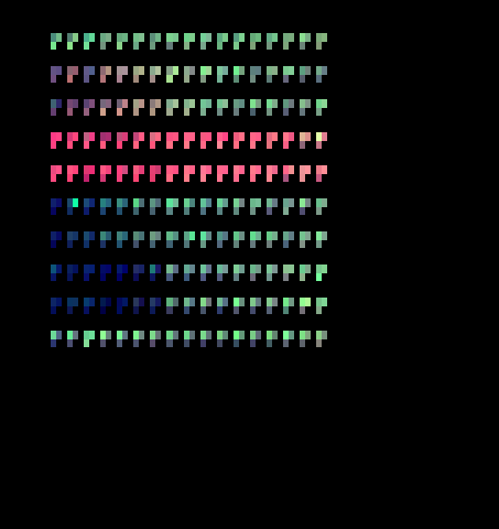
Heatmap representation of the screen plate. Access additional heatmaps through the NEXT/BACK links at the bottom of the page. Three measurements from the NeuriteQuant analysis are represented by the three principal colors red, green and blue. Each position of the screen plate is shown as a cluster of colored spots representing the individual images analyzed per position. The raw image data and the image processing reports are immediately accessible by clicking on any cluster in the heatmap representation. This particular heatmap uses the following color coding:
red: neurite length MAP2
green: cellbody area MAP2
blue: mean intensity MAP2
Due to this color choice, shifts in the ratio between MAP2-positive neurite length and MAP2-positive cellbody area are detected as shifts between the color hues red and green. In this case, red hues indicate longer neurites per neuronal cellbody area, while green hues indicate shorter neurites per neuronal cellbody area. Note the gradual increase in MAP2-positive neurites with increasing Cytochalasin D amounts (rows 2 and 3, from right to left) and the strong increase in neurite length after addition of taxol in concentrations spanning several orders of magnitude (rows 4 and 5). A general reduction of all measurements, such as in toxic treatments (high nocodazole or high actinomycin D in left columns of rows 6,7,8 and 9) leads to reduction of both neurite length and neuronal cell body area, which results in a dark blue color within the heatmap. Click NEXT to review other aspects of this morphometric analysis.